Tuesday, December 4, 2012

Bows and Arrows Calendar Show

I'm really excited to be participating in the Bows and Arrows calendar project this year. They will be selling calendars featuring a different Sacramento artist's work each month. I'll be in great company for sure. I'm planning on snagging a few of these myself to use as holiday gifts.


This Friday (12.4.12) is the opening show for this project. All of the original works from the calendar will be on display and for sale in the Bows and Arrows gallery space. This will be a great show with a wide variety of quality work. More info on the event can be found here.

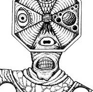
Here are some process pictures of the piece that I'll have in the show.


Black lines screen printed, one coat of watercolor down. 
You can sort of see the block out fluid I used for the stars up at the top.


Some more paint is down. Trying to build up the richness of the color
and add depth with some shading.


Here I am cutting out the finished painting.
After this I mounted it on a wooden panel.

All right! If you want to see the finished work you'll have to come see it in person...or buy a calendar!

Monday, September 10, 2012

PRINTS FOR SALE


"Cthulhu Enjoys a Smoke" art print
screen print hand painted with watercolor
frame 12"x15" print 8"x10" 
2/2
$OLD


"Woodland Sorcerer" art print
screen print hand painted with watercolor
frame 12"x15" print 8"x10"
1/2
$100

email me to purchase

Monday, September 3, 2012

A while back I entered a logo design contest for the Hellyer County Park Velodrome. I wanted to go for something with a retro feel to it since all of my memories of that place are from my childhood. My mom and I used to ride our bikes there when I was a kid and watch the racers do their thing. Anyway, I didn't win the contest but I still like what I made.
Salt Point 6 shirt
click to enlarge

This is the shirt design for the 2012 excursion to Salt Point. This one was a collaborative effort between Jon Bafus and myself. The pink worms wriggling out of the pelican's pouch are his creations.  

Wednesday, July 18, 2012

Logo design for Lower Home Energy

Tuesday, May 29, 2012

The Mighty Crustacean
screen print and water color on paper / edition of 4
 
Here is another print that I made for my bathroom art show at Bows and Arrows this month. Like most of the others, this is a one color screen print, colored by hand with watercolor paints.

This drawing has been around for a while, but this is its first appearance on a physical format (besides the original anyway). I did a digitally colored version a while back, but I really like this new one a lot more. The uneven watercolor texture has a nice contrast with the sharp, screen printed lines. 

This one has an edition of four, each with a different color palette. They'll be hanging up at Bows until June 6.

Tuesday, May 22, 2012


The Intertidal Scavenger
screen print and watercolor on paper, mounted on wood panel / edition of 2

Here are two more pieces from my bathroom art show at Bows. These are one color screen prints, hand colored with watercolor paints. The images were cut out, and mounted to wood panels with Mod Podge. There are only two of these guys. They were sort of done as an experiment, and I am quite happy with how they came out. I really like the contrast between the wood surface and the print. Also, the Mod Podge adds a thick, glossy texture that enhances the look of the prints, and makes the colors a seem more vibrant. I'm definitely going to be mounting more of my prints this way in the future. Anyway, go check these out while you still have the chance, the show comes down at the beginning of June.


Wednesday, May 16, 2012


The Old Wise One
screen print and water color on paper / edition of 4

Here is another print that I made for my bathroom art show at Bows and Arrows this month. This is a one color screen print, colored by hand with watercolor paints. This one has an edition of four, each with a different color palette. They'll be hanging up at Bows until June 6.

Sunday, May 13, 2012


Cthulhu Enjoys a Smoke
screen print and water color on paper / edition of 2

This is one of the pieces I made for my bathroom art show at Bows and Arrows this month. This is a one color screen print, colored by hand with watercolor paints. There are two pieces based off this print, each with a different color palette. They'll be hanging up at Bows until June 6.


Monday, May 7, 2012

Bows and Arrows have posted a short interview with me on their blog! Highlights include the origins of "Archradish" and some Dino Riders related content.

http://bowscollective.com/blog/?p=2408

Tuesday, May 1, 2012


My work is going to be hanging in the bathroom galleries at Bows and Arrows in Sacramento for the month of May. I'm going to be displaying a lot of hand painted screen prints at this show. I'll be posting some images of the work from the show throughout the month. In the main gallery there will be artwork from Michael Hoffee and Jon Bafus. Should be rad!

Monday, February 6, 2012


This is a tattoo design that I did for one of my best friends. The inspiration for this one was the old Ford Econoline that he used to drive in high school. This van was our shuttle on countless expeditions to Guitar Showcase, where many hours were spent trying out gear that we would never actually buy. This is the first tattoo I've ever tried to design, I hope it looks as killer on skin as it does on screen.

Wednesday, February 1, 2012

Here is a logo design I did for The Public Access Show. My buddy Arjun (who also plays drums in Wallpaper) is the mastermind behind this amazing program. He just posted the second episode which features a sweet animated version of the logo. Go check it out!

Tuesday, January 24, 2012


Here is a new shirt design I did for the band Horseneck. I got to see them play with Red Fang a while back and it was rad. This illustration was primarily inspired by the armor that horses wore into battle. And yeah, horses are a bitch to draw. Luckily this one is just a bust, cuz when you get down to the legs things start getting real.

Tuesday, January 10, 2012


Some process pics from my most recent printing project.

Thursday, January 5, 2012


Here is a new screen print that I did last week. I'm really happy with how these came out. It seems like each time I take on a new printing project I learn something new about the process that makes things easier for the next one. With each new project I feel my technique getting cleaner and more consistent. Anyway! This is a drawing I did some years ago. It was originally used for some shirts I printed up for the annual pilgrimage to Salt Point. I still feel like it's one of the best things I've drawn. This screen printed poster is 3 ink colors printed on 11 x 17 white paper, with an edition of 20 prints. I'll be putting them up for sale on the webstore shortly.